
Icons
Atrium generates local CSS from Iconify JSON at build time. Boxicons, Font Awesome 6 and 7, and Lucide are supplied as configurable presets. Import only the styles your application uses. The browser needs no Iconify JavaScript runtime, API, CDN, or icon font.
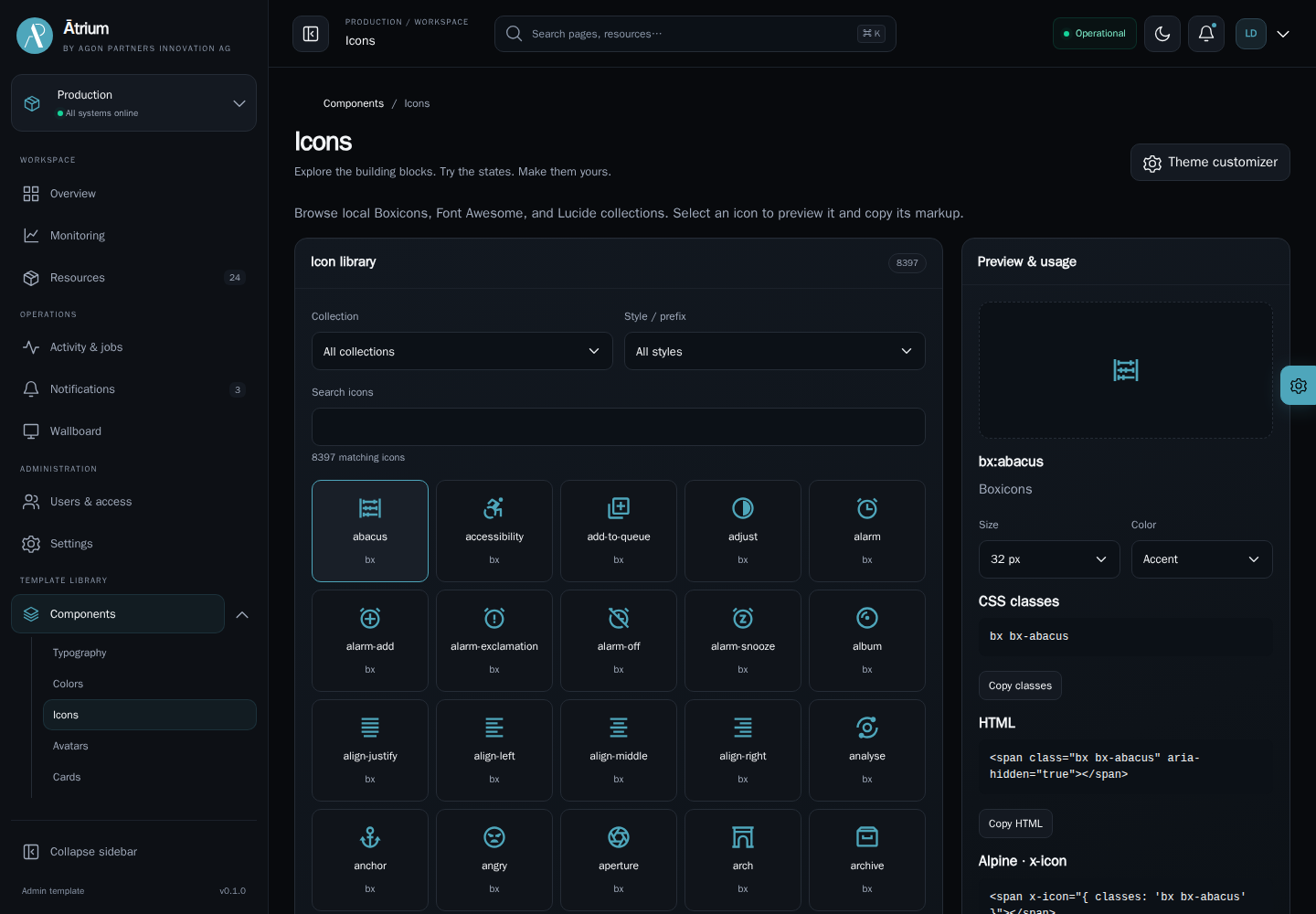
The complete showcase at /components/icons provides family and prefix filters, name/class search, pagination, adjustable previews, clipboard examples, button and badge examples, and the existing built-in vocabulary. The page loads its styles and metadata lazily. All controls support the four showcase languages, light/dark themes, and RTL layout.
Configure the application
Both published applications include an application-owned icons.config.mjs. The shared generator is exported from @agon/atrium/vite. Keep this import in Node/Vite configuration, outside browser modules.
import { iconSets } from '@agon/atrium/vite';
export const iconSources = [  iconSets.boxicons,  iconSets.fontAwesome7,  iconSets.lucide,];
Add the plugin alongside the existing HTML plugin in vite.config.mjs:
import { adminIcons } from '@agon/atrium/vite';import { iconSources } from './icons.config.mjs';
// Inside the existing Vite configuration:plugins: [  adminIcons({ sources: iconSources }),  // Keep the existing adminHtml({ root, routes }) plugin here.],
Import styles from the application entry when they are used throughout the shell. Import them from a route controller when they are needed only on that lazy page:
import 'virtual:atrium/icons/boxicons.css';import 'virtual:atrium/icons/font-awesome7.css';import 'virtual:atrium/icons/lucide.css';The starter configures Boxicons and Font Awesome 7 without importing their CSS, since its initial pages use built-in SVG icons. Add an import when using collection classes, and prefer explicit subsets for application icons. The showcase configures those two plus Lucide and imports all three from its icons page. Enabling a source makes its virtual stylesheet available. It does not automatically add that stylesheet to every page. CSS imported by a visited route can remain loaded after navigation.
adminIcons() without options configures Boxicons and Font Awesome 7. Pass sources: [] to disable all collections. Remove matching imports when disabling or renaming a source. An import for an unconfigured stylesheet fails during the build.
Use CSS classes
<span class="bx bx-user" aria-hidden="true"></span><span class="bx bxs-user" aria-hidden="true"></span><span class="bx bxl-github" aria-hidden="true"></span><span class="fa-regular fa-user" aria-hidden="true"></span><span class="fa-solid fa-user" aria-hidden="true"></span><span class="fa-brands fa-github" aria-hidden="true"></span><span class="lucide lucide-user" aria-hidden="true"></span>Font Awesome style and icon classes belong on the same element. These are SVG-backed CSS classes, so features from the original font libraries, such as their animation utilities or font glyph codes, are not included.
Generated monochrome icons inherit color and use 1em sizing. Set font-size on a plain CSS icon or its parent. Multicolor custom collections retain their palette through background images. Icons keep their original direction in RTL. Consumers decide which directional icons should be mirrored.
Use the Alpine directive
createAdmin registers x-icon. It accepts existing built-in names or a descriptor with a classes string:
<button type="button" class="btn btn-secondary icon-button" aria-label="Refresh" @click="refresh">  <span x-icon="'refresh'"></span></button>
<button type="button" class="btn btn-primary">  <span x-icon="{ classes: 'bx bx-user' }"></span>  Profile</button>
<span x-icon="selectedIcon"></span>
A provider can expose selectedIcon: { classes: 'fa-solid fa-user' } and replace it reactively. Import the matching CSS before rendering. The directive replaces its child with a decorative span for CSS descriptors or an inline SVG for built-in names. --icon-size controls either form and defaults to 20px. Apply color to the surrounding control.
The built-in names exported as iconNames from @agon/atrium/services/icons retain their existing behavior. Unknown names and invalid descriptors fall back to the built-in box. CSS class strings are assigned as classes, never injected as HTML. An unknown CSS class simply has no matching icon asset.
The directive uses an Alpine-owned reactive effect. Removing the element releases the effect through Alpine’s lifecycle. There are no icon timers, network requests, or manual teardown methods. Accessible names belong to the surrounding button or link. Set aria-hidden="true" on decorative plain CSS icons and give icon-only controls a readable accessible name.
Source settings
| Setting | Meaning |
|---|---|
name | Unique source identifier using letters, digits, underscores, or hyphens. |
label | Optional readable catalogue label. Defaults to name. |
outputFile | Unique CSS basename, for example boxicons.css. Forms the virtual import name. |
json | Nonempty array of absolute paths to locally installed or application-owned Iconify JSON files. |
commonSelector | Shared rendering selector. Defaults to empty, generating self-contained per-icon rules. |
iconSelector | Per-icon selector. Defaults to .{prefix}-{name}. |
contentReplaceRegexp | Optional regular expression applied to generated CSS and catalogue selectors. |
contentReplaceValue | Optional replacement text. Defaults to empty. |
include | Optional map from collection prefix to icon-name arrays. Omission includes all icons and aliases. When supplied, omitted prefixes produce no icons. |
notice | Attribution text emitted as a preserved CSS license comment. Supply the required notices for custom collections. |
The supplied presets are ordinary configuration objects. Spread a preset to override its filenames, selectors, or subsets without modifying package source:
import { iconSets } from '@agon/atrium/vite';
export const iconSources = [  {    ...iconSets.boxicons,    include: {      bx: ['user', 'search', 'refresh'],      bxs: ['star'],      bxl: ['github'],    },  },];
Subsets explicitly control payload size and include dynamically selected icon names. The generator does not scan HTML or discard classes based on static usage. Aliases are included by default and their transformations are preserved. Invalid JSON, unreadable paths, duplicate identifiers/filenames, and unknown requested icon names fail the build.
Choose iconSets.fontAwesome6 with virtual:atrium/icons/font-awesome6.css to use Font Awesome 6. Both versions normalize to the familiar .fa-* classes. Load one Font Awesome major version per application. If both are deliberately required, give them distinct selectors and import names to avoid collisions.
Add another collection
Install the individual @iconify-json/<prefix> package as a development dependency in the consuming application, or provide a local Iconify JSON file. Use createRequire in your application configuration so resolution starts from that application’s dependencies:
import { createRequire } from 'node:module';import { iconSets } from '@agon/atrium/vite';
const require = createRequire(import.meta.url);
export const iconSources = [  iconSets.boxicons,  {    name: 'custom',    outputFile: 'custom.css',    commonSelector: '.custom',    iconSelector: '.custom-{name}',    json: [require.resolve('./assets/custom-icons.json')],    notice: 'Your collection author and required license notice.',  },];
Import virtual:atrium/icons/custom.css and use <span class="custom custom-name" aria-hidden="true"></span>. Any collection compatible with Iconify JSON can use this configuration. Keep external SVG collection inputs trusted and reviewed. Collection licensing and attribution remain the consumer’s responsibility.
Build output and catalogue metadata
Vite processes virtual CSS as normal application CSS, applying the configured development/production minification policy, content hashes, and base-path handling. outputFile names the virtual source. Final asset names and grouping are owned by Vite. No generated CSS is written into maintained source directories. Local JSON changes clear the generator cache and reload the development page. Changes to icons.config.mjs restart Vite through its configuration dependency tracking.
For a custom picker, import the optional metadata only where needed:
import catalog from 'virtual:atrium/icons';The generated module packs repeated selector patterns to reduce transfer and parse costs, then reconstructs the same public catalogue. Each source contains name, label, outputFile, and icons. Each icon has id (prefix:name), name, prefix, expanded selector, and classes. Same-element class selectors produce copyable class strings. Complex selectors, such as descendant or pseudo-element selectors, have an empty classes field and require consumer-authored markup. The showcase omits those entries from its interactive preview grid. Its controller explicitly imports each configured demo stylesheet. Add the corresponding import when extending that gallery’s configuration.
For a non-Vite build, the same generator is available in Node:
import { writeFile } from 'node:fs/promises';import { generateIconSource, iconSets } from '@agon/atrium/vite';
const { css } = await generateIconSource(iconSets.boxicons, true);await writeFile('/absolute/existing/output/boxicons.css', css);
The boolean selects compressed output. Omit it for readable CSS. The caller owns output-directory creation and packaging. No Gulp task is involved.
CSP and attribution
CSS uses SVG data URLs, so retain img-src 'self' data: in the deployment policy. Icon rendering does not require a remote connect-src, script allowance, or font source. Use the production verification procedure to check the real deployment policy.
Boxicons uses MIT. Font Awesome Free SVG icons use CC BY 4.0, including attribution. Lucide includes ISC and MIT notices for its Feather-derived icons. Brand marks remain subject to their owners’ rights. The generator adds /*! @license ... */ comments and emits a complete icon-licenses.txt alongside the production entry document. Deploy this file with the application because downstream CSS processors may remove individual comments. This icon integration does not change Atrium’s own license or include Font Awesome Pro.
The build uses Iconify’s CSS generator and individual collection packages. Upstream notices are available for Boxicons, Font Awesome, and Lucide.
Return to the component index.
Author
Laurent Declercq l.declercq@agon-innovation.ch
License
Unless otherwise stated all source code is licensed under LGPL 2.1 and has the following copyright:
© 2026, Agon Partners Innovation AG, All rights reserved.The design material and the “Agon Ātrium” trademark is the property of their authors. Reuse of them without prior consent of their respective authors is strictly prohibited.
Version
Version: 20260921